Quick Summary: What You’ll Learn
- The difference between Pantone and CMYK colour systems
- When to choose accuracy over affordability
- How colour systems affect your packaging quality and consistency
- Pros and cons of each method, including cost, digital compatibility, and sustainability
- Common questions answered with expert insights from packaging print specialists
🧰 Related: Explore custom printed boxes | Book a packaging design consultation
Why Colour Accuracy Matters in Packaging Design?
In packaging, colour is more than just decoration — it’s recognition, emotion, and brand consistency rolled into one. Imagine two products on a shelf with slightly different shades of your brand’s signature red. One looks off, faded, or too dark. That inconsistency can hurt trust — and it’s often caused by the wrong colour system for the job.
That’s where Pantone and CMYK come into play. Both are used in packaging print, but they work very differently. If you want your custom boxes to always look right — no matter where or how they’re printed — it’s worth understanding how these systems stack up.
What’s the Difference Between Pantone and CMYK?
At their core, Pantone and CMYK are two approaches to printing colour — but they serve very different purposes.
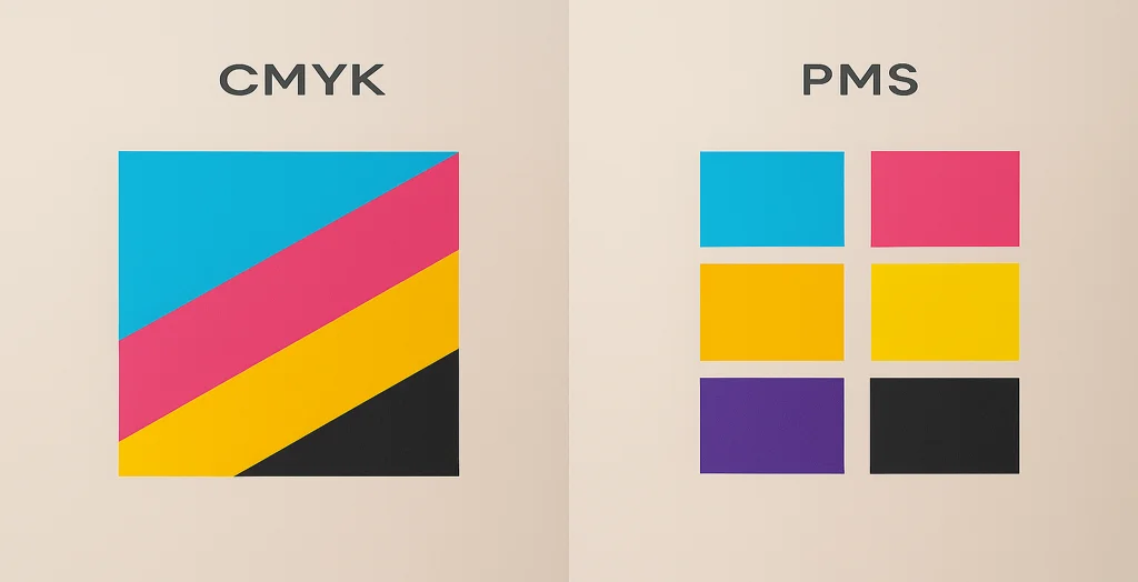
Pantone (PMS): Precision Colour Matching
Pantone, or the Pantone Matching System (PMS), uses pre-mixed inks to produce exact colours. Think of it like ordering paint from a hardware store — you get a formula, and every mix is identical.
- Great for logos, flat colours, or brand identity
- Offers unmatched colour consistency across printers
- Especially useful on both coated and uncoated packaging
CMYK: The Four-Colour Process
CMYK stands for Cyan, Magenta, Yellow, and Black. It blends these four inks to create the colours in your design. Most printers — especially digital — use this method.
- Ideal for full-colour artwork or photography
- More budget-friendly, especially for small or short runs
- Common for flexible packaging, cartons, and e-commerce boxes
Should You Use Pantone or CMYK for Your Packaging?
This depends on what you’re printing — and how much control you need over the result.
Choose Pantone if:
- Your brand relies on consistent, signature colours
- You’re printing at scale and can justify the setup cost
- You’re using offset printing and want pinpoint colour matching
Choose CMYK if:
- You’re running short print batches
- Your design uses gradients, shadows, or photography
- You’re working with digital or on-demand printing
Real Example: One of our clients, a premium skincare brand, needed exact matches for their muted lavender colour across multiple box finishes and sizes. Pantone delivered perfect consistency, while CMYK struggled to maintain the right tone on kraft and uncoated stocks.
Is CMYK OK for Digital Printing?
Absolutely — in fact, CMYK is the standard for digital printing. Most short-run and variable print jobs rely on digital presses using CMYK ink sets. The flexibility of this process makes it ideal for start-ups, seasonal packaging, or promotional runs where speed and affordability matter more than exact matching.
That said, if you’re working on packaging that needs to look identical across multiple print batches, Pantone is more reliable.
Can You Convert CMYK to Pantone?
Yes — but it’s not perfect.
There are online tools and software plugins (like Adobe Illustrator’s Pantone libraries) that let you convert CMYK values to the nearest Pantone equivalent. However, because Pantone includes colours outside the CMYK colour gamut (like neon, metallic, or deep navy), some shades won’t match exactly.
Pro Tip: Always test print before going to production. A Pantone swatch on screen can look very different in print — especially on kraft, textured, or recycled board.
Is Pantone More Expensive Than CMYK?
In most cases, yes.
Pantone inks require custom mixing and separate plates for each colour, which adds cost — especially for short runs. It’s ideal for large-scale offset printing where that extra precision pays off across thousands of boxes.
CMYK, on the other hand, uses standardised four-colour printing, which is cheaper, quicker, and widely supported.
So, if you’re wondering “Is Pantone worth the extra cost?” — the answer is: only if colour precision is non-negotiable.
Is Pantone or CMYK Better for Printing?
There’s no one-size-fits-all answer — both have strengths:
| Feature | Pantone (PMS) | CMYK |
| Colour accuracy | ⭐⭐⭐⭐⭐ | ⭐⭐ |
| Budget-friendly | ⭐ | ⭐⭐⭐⭐ |
| Suitable for photos | ❌ | ✅ |
| Setup cost | High | Low |
| Run length | Medium–Large | Short–Medium |
| Digital compatible | No (mostly) | Yes |
What Are the Downsides of Pantone?
While Pantone offers unbeatable colour consistency, it does come with a few drawbacks:
- Higher cost, especially on short runs
- Limited flexibility in design — not great for gradients or photos
- Not always available on digital presses
- Adobe now requires a paid plugin to access Pantone libraries in Illustrator/Photoshop
When Should You Use CMYK?
Use CMYK when you need:
- Full-colour imagery, gradients, or soft transitions
- Fast turnaround and low MOQ
- Flexibility across different designs and product variants
- Affordable short-run packaging for seasonal, event-based, or influencer kits
CMYK gives you flexibility and affordability — but not guaranteed colour precision.
🙋♀️ Still Got Questions?
Can I combine Pantone and CMYK in one design?
Yes — many brands do this. For example, you can print your logo in Pantone and use CMYK for the rest of the artwork.
Will Pantone look different on kraft vs white board?
It might. Even with Pantone, the material affects colour output — so test before bulk printing.
Can Pantone colours fade less over time?
Generally, yes. Because they’re solid inks, they’re less affected by the dot gain or inconsistency CMYK can have in large print runs.
Can CMYK match my brand colour if I give the HEX code?
Not always. HEX is for screens (RGB), and converting that to CMYK or Pantone will often require tweaks.
Ready to Choose the Right Colour System for Your Packaging?
The colour system you choose will shape how your product looks — and how it’s remembered. Whether you’re building a luxury brand that relies on colour precision or running an agile e-commerce line with flexible needs, we’ll help you choose the right path.
🎨 Need guidance? Healey Packaging can help you test print results, convert colours, or run Pantone–CMYK combinations with precision.
👉Contact us today for a colour consultation, or request a printed sample to see the difference for yourself.


