Colour selection for packaging is not simply a choice between “accurate” and “affordable”. CMYK and Pantone serve different purposes, and the best option depends on the artwork, number of colours, printing method, substrate, production quantity and how closely a particular brand shade needs to be controlled.
CMYK is widely used for process printing, photography, gradients and multi-colour artwork. Pantone references can be useful when a defined brand colour needs more specific control, but the final appearance can still change with the board, ink system and finish. This guide explains the practical differences and when each approach may be appropriate.
Pantone vs CMYK: Which Is Better for Packaging?
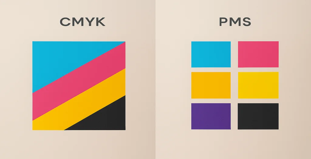
CMYK is a four-colour process system suited to full-colour artwork, photographs, gradients and designs containing many colours. Pantone provides defined colour references and can be used as a spot-colour system where closer control of a particular brand shade is required.
Neither system is automatically better for every packaging project. Printing method, substrate, quantity, finishes and colour-critical requirements should all be reviewed before the final specification is approved.
Why Colour Accuracy Matters in Packaging Design?
In packaging, colour is more than just decoration — it’s recognition, emotion, and brand consistency rolled into one. Imagine two products on a shelf with slightly different shades of your brand’s signature red. One looks off, faded, or too dark. That inconsistency can hurt trust — and it’s often caused by the wrong colour system for the job.
That’s where Pantone and CMYK come into play. Both are used in packaging print, but they work very differently. If you want your custom boxes to always look right — no matter where or how they’re printed — it’s worth understanding how these systems stack up.
Pantone vs CMYK at a Glance
- CMYK is designed for process printing and works well for photographs, gradients and artwork containing many colours.
- Pantone provides defined colour references and can support closer control of specific brand colours where the print process supports spot inks.
- Pantone does not guarantee an identical result on every material; kraft, white board, coated stock and other substrates can change colour appearance.
- CMYK is not automatically the cheaper option and Pantone is not automatically more expensive; production economics depend on the print method, quantity and complete specification.
- CMYK and Pantone can be combined in suitable print workflows, for example CMYK graphics with a separately specified spot-colour logo.
- Proofing and agreed colour references are important when a particular shade is critical to the brand.
What’s the Difference Between Pantone and CMYK?
At their core, Pantone and CMYK are two approaches to printing colour — but they serve very different purposes.
Pantone (PMS): Precision Colour Matching
Pantone, or the Pantone Matching System (PMS), uses pre-mixed inks to produce exact colours. Think of it like ordering paint from a hardware store — you get a formula, and every mix is identical.
- Great for logos, flat colours, or brand identity
- Offers unmatched colour consistency across printers
- Especially useful on both coated and uncoated packaging
CMYK: The Four-Colour Process
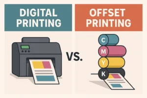
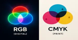
CMYK stands for Cyan, Magenta, Yellow, and Black. It blends these four inks to create the colours in your design. Most printers — especially digital — use this method.
- Ideal for full-colour artwork or photography
- More budget-friendly, especially for small or short runs
- Common for flexible packaging, cartons, and e-commerce boxes
| Feature | Pantone / Spot Colour | CMYK |
|---|---|---|
| Colour System | Defined colour references that may be printed as dedicated spot inks | Four-colour process using cyan, magenta, yellow and black |
| Best Suited To | Specific brand colours, logos and controlled solid shades | Photography, gradients, illustrations and multi-colour artwork |
| Colour Control | Can provide closer control of defined shades in suitable workflows | Reproduces colours through combinations of process inks |
| Photography | Usually used alongside a process system rather than alone | Well suited to photographs and tonal images |
| Material Influence | Final appearance can change with substrate and finish | Final appearance can change with substrate and finish |
| Digital Printing | Pantone references may be simulated or matched through the available digital colour system; true spot-ink capability depends on the press | Commonly supported in digital process printing |
| Cost | Depends on ink setup, print method, quantity and number of spot colours | Depends on print method, quantity and complete production specification |
| Run Length | No fixed minimum or ideal run length | No fixed minimum or ideal run length |
Should You Use Pantone or CMYK for Your Packaging?
This depends on what you’re printing — and how much control you need over the result.
Choose Pantone if:
- Your brand relies on consistent, signature colours
- You’re printing at scale and can justify the setup cost
- You’re using offset printing and want pinpoint colour matching
Choose CMYK if:
- You’re running short print batches
- Your design uses gradients, shadows, or photography
- You’re working with digital or on-demand printing
Can Pantone and CMYK Be Used Together?
Yes, where the selected printing process supports the required setup. A pack might use CMYK for photographs and multi-colour graphics while a logo or signature brand shade is specified separately as a Pantone or spot colour.
This does not mean every job should add a spot ink. Each additional colour can affect setup, production and cost, so the combination should be justified by the artwork and colour requirements.
Is CMYK OK for Digital Printing?
Absolutely — in fact, CMYK is the standard for digital printing. Most short-run and variable print jobs rely on digital presses using CMYK ink sets. The flexibility of this process makes it ideal for start-ups, seasonal packaging, or promotional runs where speed and affordability matter more than exact matching.
That said, if you’re working on packaging that needs to look identical across multiple print batches, Pantone is more reliable.
Can You Convert CMYK to Pantone?
Yes — but it’s not perfect. There are online tools and software plugins (like Adobe Illustrator’s Pantone libraries) that let you convert CMYK values to the nearest Pantone equivalent. However, because Pantone includes colours outside the CMYK colour gamut (like neon, metallic, or deep navy), some shades won’t match exactly.
Is Pantone More Expensive Than CMYK?
In most cases, yes. Pantone inks require custom mixing and separate plates for each colour, which adds cost — especially for short runs. It’s ideal for large-scale offset printing where that extra precision pays off across thousands of boxes.
CMYK, on the other hand, uses standardised four-colour printing, which is cheaper, quicker, and widely supported. So, if you’re wondering “Is Pantone worth the extra cost?” — the answer is: only if colour precision is non-negotiable.
Is Pantone or CMYK Better for Printing?
There is no single better option for every packaging project. The right choice depends on the artwork, colour requirements, printing method, material and production specification.
CMYK is generally more suitable for photographs, gradients, illustrations and designs that contain many colours. Pantone or spot colours can be useful when a specific logo or brand shade needs a more controlled colour reference.
Some packaging projects use both systems together—for example, CMYK for full-colour graphics and a separately specified Pantone colour for a key brand element. The final choice should be confirmed against the selected substrate and printing process before production.
What Are the Downsides of Pantone?
While Pantone offers unbeatable colour consistency, it does come with a few drawbacks:
- Higher cost, especially on short runs
- Limited flexibility in design — not great for gradients or photos
- Not always available on digital presses
- Adobe now requires a paid plugin to access Pantone libraries in Illustrator/Photoshop
When Is CMYK a Good Choice for Packaging?
CMYK is a practical choice when the artwork contains several colours, photography, gradients or tonal illustration. Because colours are built from four process inks, one artwork can reproduce a broad range of visual content without requiring a separate spot ink for every shade.
CMYK can be particularly useful for:
- Product photography.
- Illustrated packaging.
- Multi-colour graphics.
- Gradients and tonal artwork.
- Seasonal designs that use several colours.
A specific brand colour may still require additional review if the CMYK conversion does not reproduce the required shade closely enough.
Related Colour Guide Understand RGB vs CMYK for Packaging PrintCommon Questions About Pantone and CMYK
Practical answers about brand colours, kraft board, digital printing, HEX conversion and combining process and spot colours.
Can I combine Pantone and CMYK in one packaging design?
Yes, where the selected printing process supports it. CMYK can handle photographs and multi-colour graphics while a logo or important brand shade is specified separately as a Pantone or spot colour. Additional colours can affect setup and cost, so the combination should be agreed before production.
Will a Pantone colour look different on kraft and white board?
It can. The underlying substrate affects how printed colour appears. Natural kraft, white coated board, uncoated stock and other materials can produce different visual results even when the same colour reference is used. Proofing on a representative material is useful when the shade is critical.
Are Pantone colours more fade-resistant than CMYK?
Not as a general rule. Fade resistance depends on factors such as ink chemistry, pigment, light exposure, substrate, coating and storage conditions. Pantone and CMYK describe colour systems rather than a universal durability rating.
Can CMYK match my brand colour from a HEX code?
Not necessarily. HEX values describe screen colours and do not have a guaranteed one-to-one CMYK or Pantone equivalent. Convert the artwork for print, compare the resulting colour and use an agreed Pantone or physical reference if closer brand-colour control is required.
Is Pantone more accurate than CMYK?
Pantone can provide a more specific reference for a defined brand shade and, in suitable spot-colour workflows, closer control of that individual colour. It does not guarantee an identical result across every press, material or finish.
Is CMYK cheaper than Pantone printing?
Not automatically. Cost depends on the printing method, number of colours, quantity, setup requirements, material and finishes. Conventional spot-colour printing may require additional ink or plate setup, while the economics of digital and process printing vary by project.
Can digital printing reproduce Pantone colours?
Many digital systems can target or simulate Pantone references using their available process or expanded-gamut inks, but that is not the same as printing a dedicated Pantone spot ink. Capability and expected colour tolerance depend on the specific press and material.
Which is better for packaging, Pantone or CMYK?
Use CMYK when the artwork relies on photographs, gradients or several colours. Consider Pantone or another spot-colour reference when a specific brand shade requires closer control. Some projects benefit from combining both systems.
Final Thoughts: Choose the Colour System Around the Artwork
Pantone and CMYK solve different colour-management problems. CMYK is well suited to photographs, gradients and multi-colour artwork, while Pantone references can provide greater control when a particular brand shade needs a defined production target.
The colour system should not be selected in isolation. Printing method, substrate, finishes, quantity and proofing requirements all affect the final result. For colour-critical packaging, agree the required reference and approval method before full production begins.
Planning Your Print Specification? Explore Packaging Printing Methods